Case study: Food delivery app design
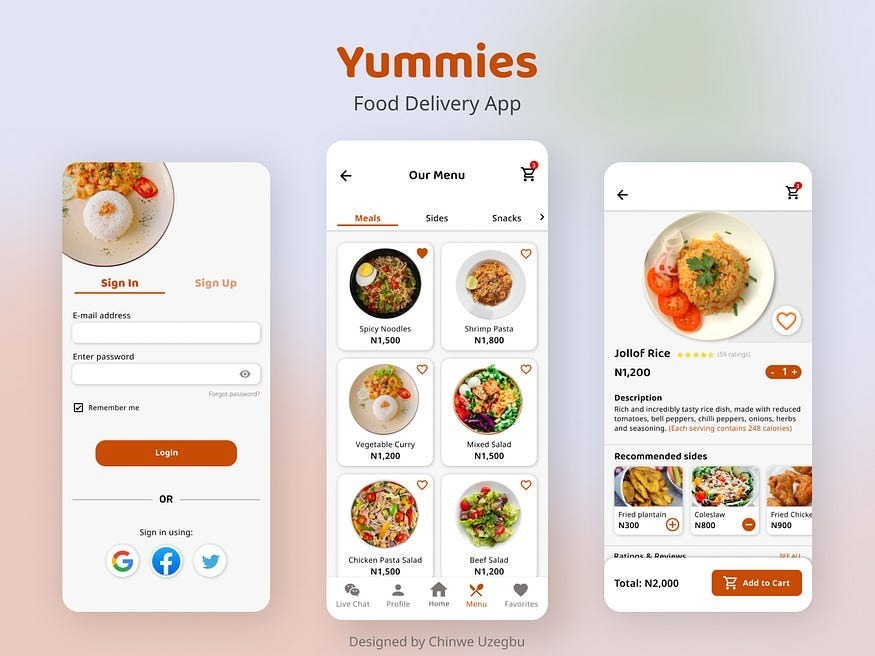
Food is essential to our well-being. And for some of us, eating is more than just a way to stave off hunger. It’s a hobby. As a self-proclaimed foodie, I’m naturally drawn to topics that are food-related. So when it came to choosing my first project for the Google UX Design Certificate, I had to jump on this one.
This case study describes my process of creating a food delivery app for a restaurant from concept to the final design.
The Challenge
Amidst the hustle and bustle of today’s fast-paced environment, individuals struggle to find the time to cook at home. Some don’t even have the time to visit a restaurant. The challenge was to find a way for these individuals to order and receive food at their own convenience.
The Goal
My Role
My Design Process
Step 1: Understanding the user
User Interviews
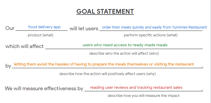
My goal was to design a mobile app that lets users order their meals quickly and easily from Yummies — a hypothetical restaurant.
User Experience Designer responsible for the app’s design from concept to delivery.
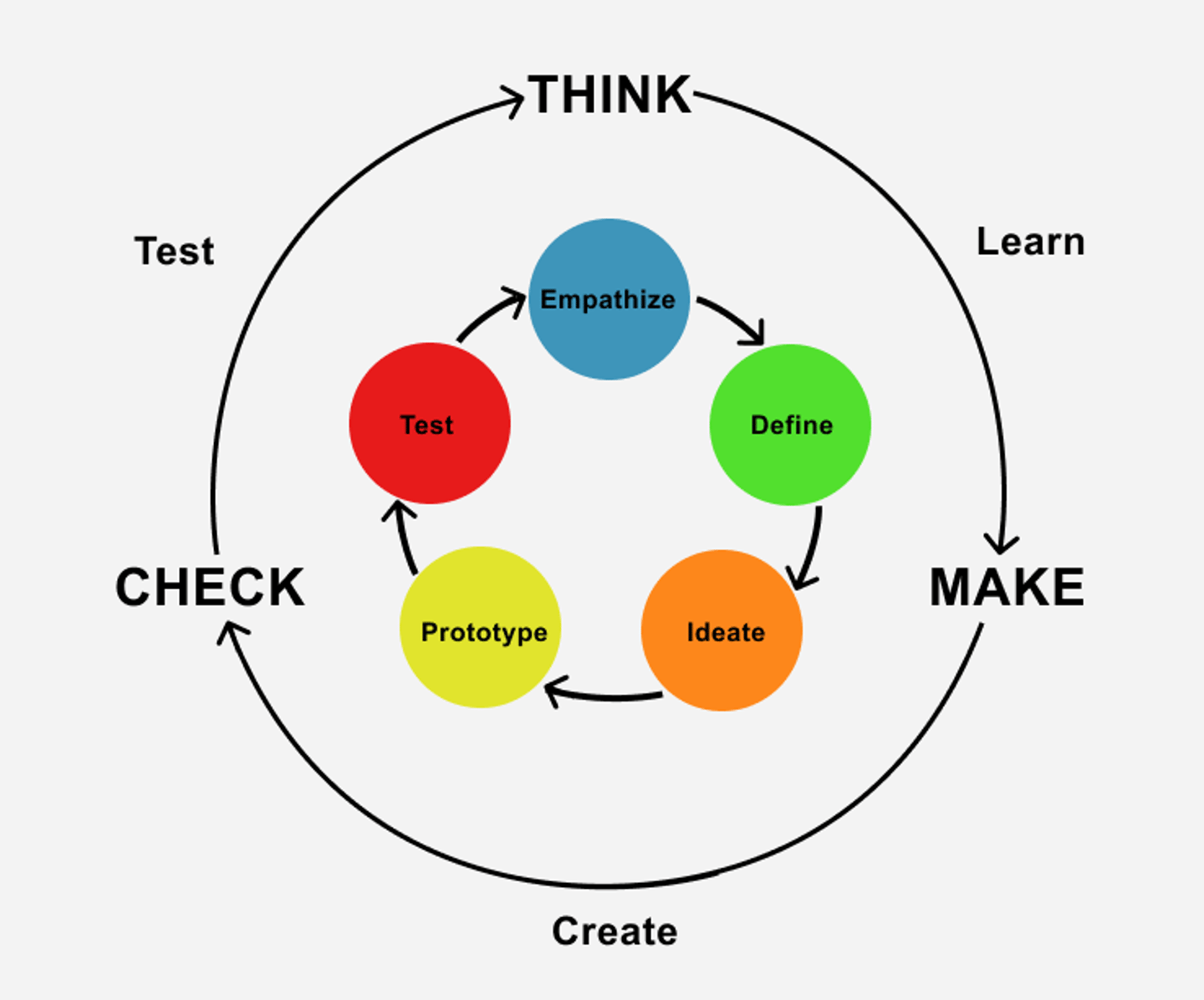
I chose to use the lean UX Design framework for this project. By letting the validation of hypotheses guide my work, I could ensure that I was creating a product that truly meets the needs of people.
The best way to truly understand the needs and motivations of the people I’m designing for is by hearing from them. So, I interviewed five (5) working adults aged between 18 and 65 years, who have some experience with ordering food online.
The participants’ responses can be summarised as follows:
5 out of the 5 participants said they are most likely to use a food ordering platform when they need a quick way to quench their hunger.
4 out of 5 participants said they do not like platforms that are difficult to use.
2 out of 5 participants prefer to pay for their food after delivery.
1 participant, who is not fluent in English, said they dislike apps that are text-heavy.
Competitive Analysis
Pain Points
User Personas
User Interviews
Context of use
Starting the design
User flow
Before jumping into the process of creating my solution, I checked out some popular food delivery apps. I interacted with the platforms and read their customer reviews. This helped me identify some drawbacks in the existing solutions and opportunities for a better user experience
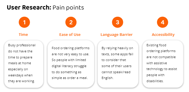
Four major pain points were identified from the foundational research phase:
Time
Ease of use
Language barrier
Accessibility
Pain points: time, ease of use, language barrier and accessibility.
When we are hungry, our concentration level drops. Even the littlest tasks can seem daunting. Therefore, the goal was to create an intuitive design — one that lets the users complete their desired task with almost no mental effort.
Based on the information gotten from the foundational research, I created a persona whose demographics, motivations, goals and frustrations represent the needs of the users.
Meet Ejiro…
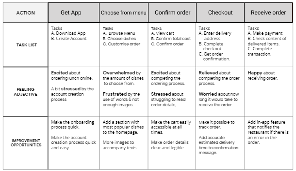
Mapping Ejiro’s user journey revealed areas where we can make improvements in his journey for a better user experience.
Now we know the exact problems faced by our users. So, what next?
A goal statement was created to ensure a problem-solution fit.
Press enter or click to view image in full size
From my research, I learned that people are most likely to use a food ordering platform when they need a quick way to quench their hunger.
“You’re not you when you’re hungry!”
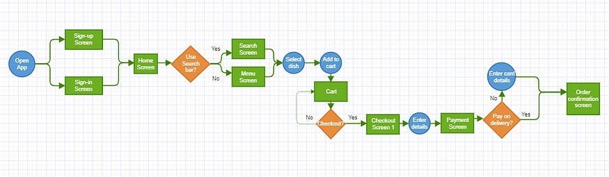
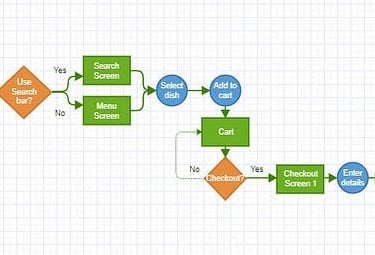
To achieve my goal of creating an intuitive design, I mapped a user flow that prioritized recognition over recall. This was done by creating a path that is familiar to the users.
Visual representation of the steps a typical user will take to achieve their main goal.
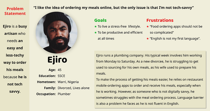
Persona and corresponding problem statement
-Snickers ad
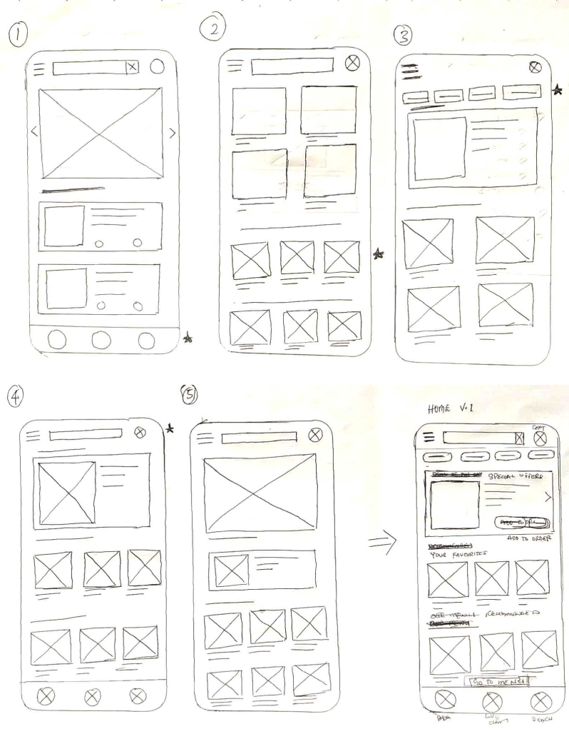
With the user flow mapped out, I then proceeded to sketch wireframes. Several iterations of each screen were drafted on paper to ensure that the elements that made it to the digital wireframes effectively addressed the user pain points.
For the home screen, I prioritized ease of use and a quick ordering process, to make the experience quick and stress-free for the users.
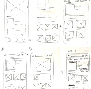
Several iterations of the home screen were sketched on paper. The stars were used to mark the elements to be used in the digital wireframes
As the design proceeded to digital, I ensured that my designs were based on the feedback from my research. I created a digital version of the wireframes in Figma and proceeded to test it with users.
To get an early insight into the app’s usability before the introduction of visual elements, I recruited 5 participants to test the low-fidelity prototype.
Another round of usability testing was conducted using the high fidelity prototype. By testing the design at this stage, I could observe an interaction that most closely resembles a real-life interaction with the final product.
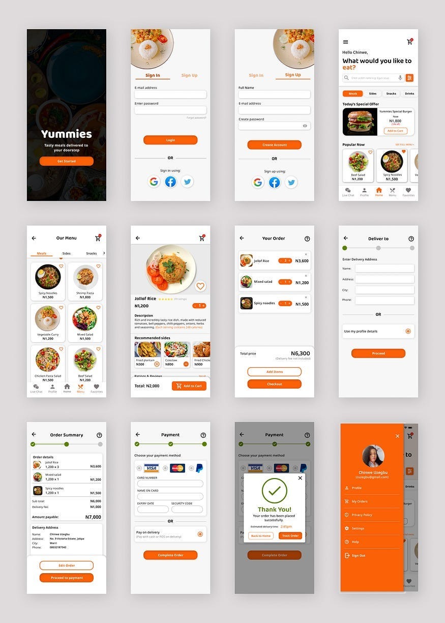
With the initial usability issues fixed, I proceeded to create mockups and a high fidelity prototype of the design.
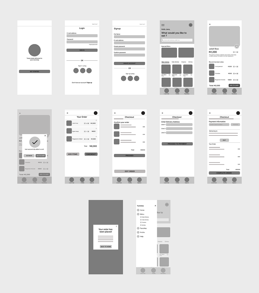
Digital wireframes of Yummies app after initial usability study
The observations were noted down and an affinity diagram was used to group similar observations to form themes
Paper Wireframes
Final Design
Usability Study (Round 2)
Refining the design
Usability Study (Round 1)
Digital Wireframes
Going digital
By watching the participants interact with the app and hearing their thoughts, I was able to identify problem areas in the app’s design. The results were noted down and an affinity diagram was used to identify patterns.
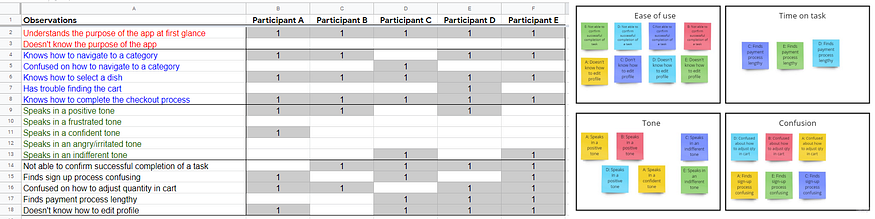
The observations were noted down and an affinity diagram was used to group similar observations to form themes
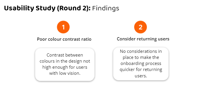
Findings from the second round of usability studies
Changes made based on findings
Straightforward, no-gimmick onboarding process to save time
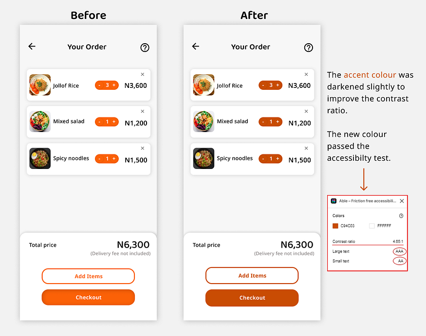
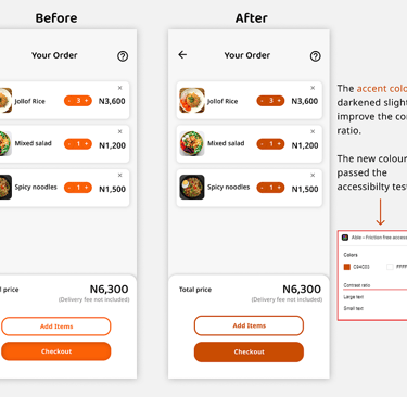
Improved colour contrast ratio
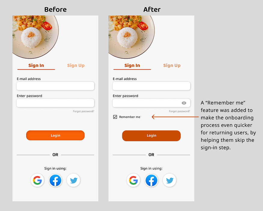
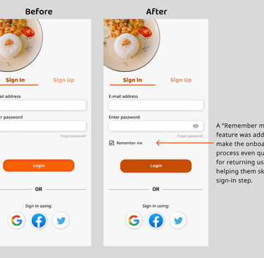
A “Remember me” feature was added to make the process quicker for returning users.
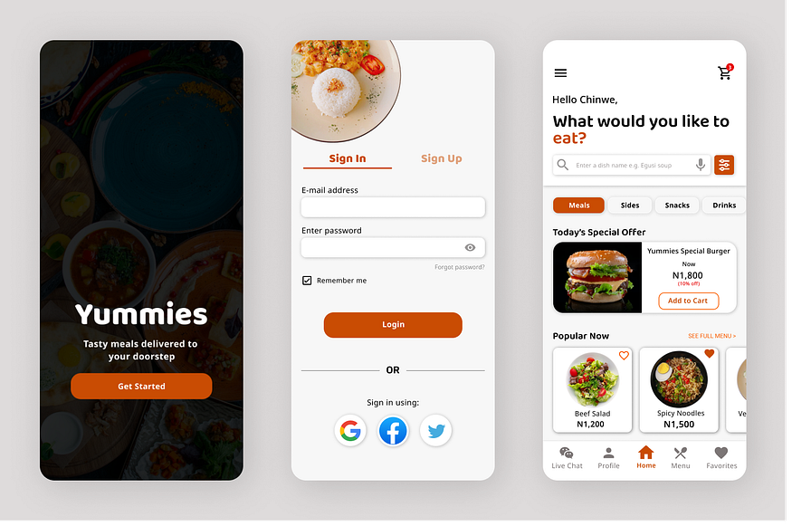
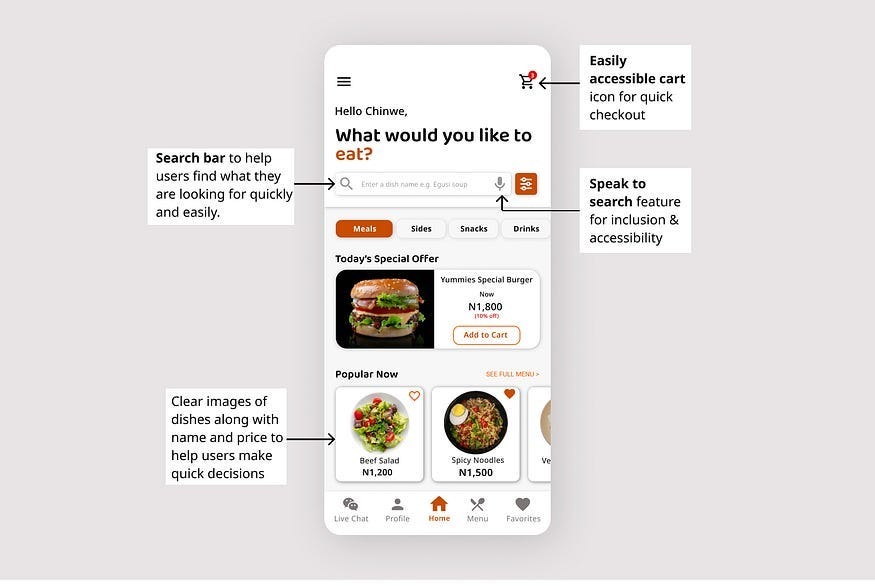
Home screen
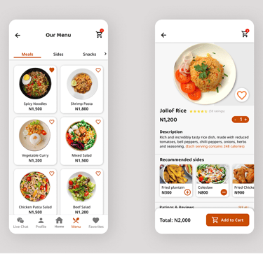
Simple menu screen. Details screen consists of food description, price, quantity, recommended sides (anticipating the user’s needs), ratings and reviews.
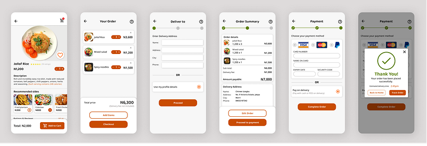
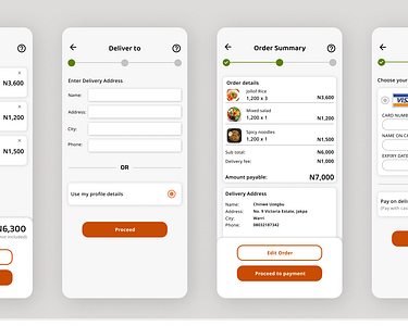
An easy ordering process with added shortcuts for returning users. Pay on delivery option included.
High-fidelity prototype of Yummies app
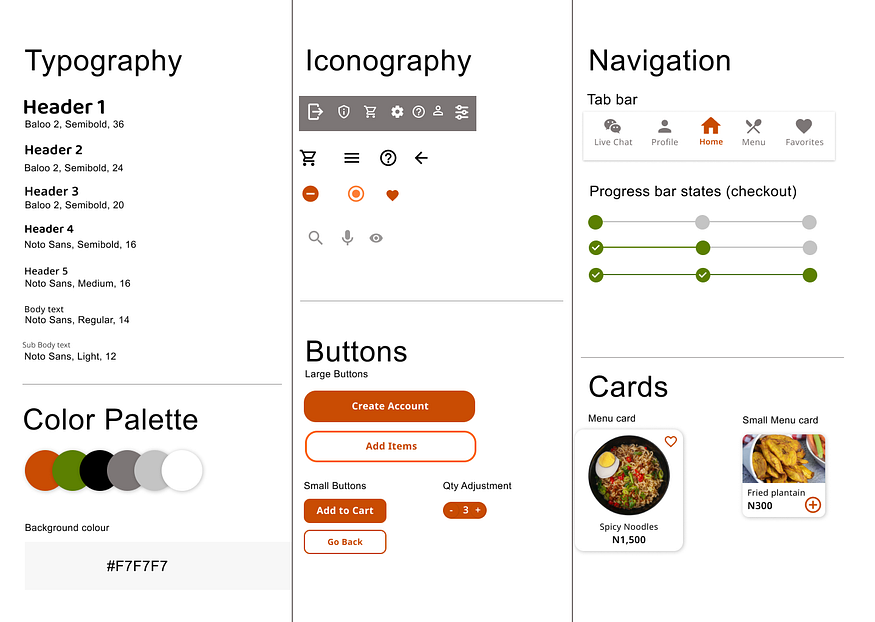
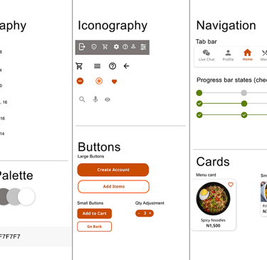
Style Guide
Style Guide for handing off the design to developers
Inclusive and Accessible design
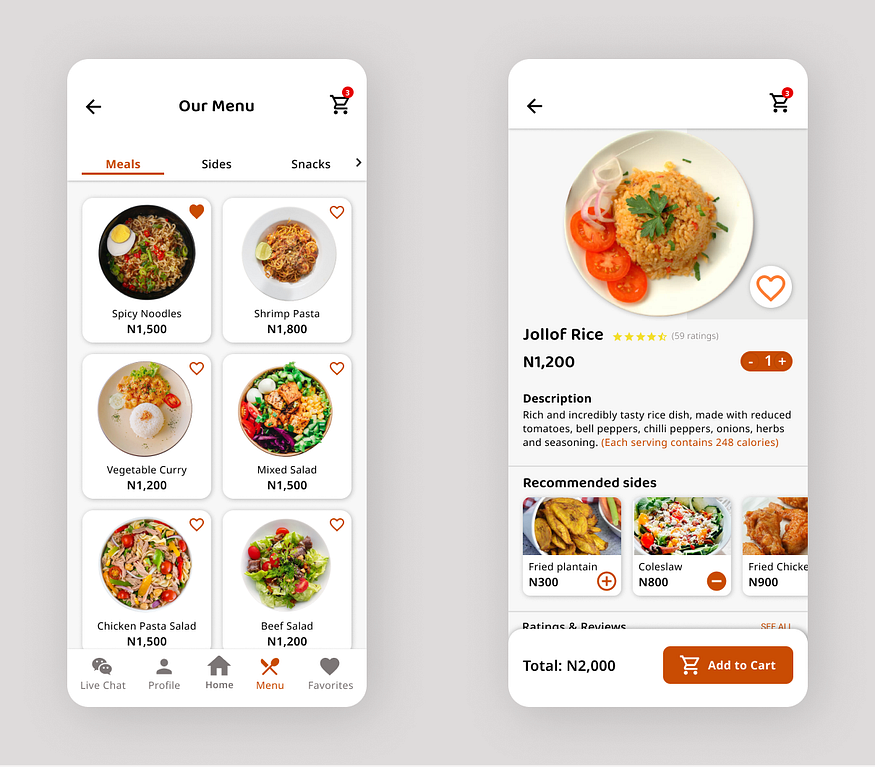
My aim was to create a design that considers the full range of human diversity, with respect to ability, age, language and other forms of human difference. More importantly, I wanted a similar user experience for every user, regardless of their abilities. Here are some decisions I made to reflect this:
Considering that some users of the app might not be able to read English, I tried not to rely too heavily on text: Images, colours and recognizable icons were strategically used to direct users to the appropriate actions.
To ensure compatibility with assistive technology such as screen readers, I included image descriptions and used appropriate hierarchy and emphasis throughout the design.
High contrasting colours were used to make it easy to differentiate between elements.
A speak-to-search feature was included for quick and easy search.
User flow
Designed for real users
Although I only documented two usability studies, I was constantly testing the design with users and iterating it based on the feedback received. It took about 10 iterations to get to the final design.
I tested the final design with two (2) people with limited technical knowledge and they were able to complete the desired tasks without any assistance.
Takeaways & Next Steps
Takeaways
Testing a product with real users helps give a new perspective on things: Through my usability studies, I was reminded that each individual is unique. So the best way to learn about the usability of a product is by testing it with different people.
Next Steps
The next step would be to conduct another round of usability studies with a wider range of participants, to determine whether the current solution effectively addresses the users’ pain points.
Project Reviews
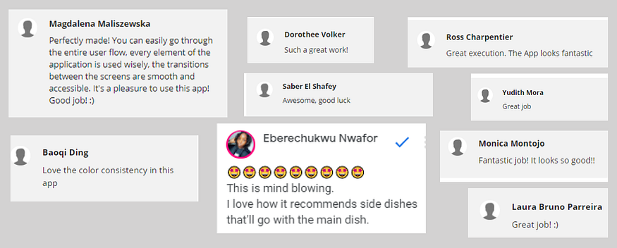
Peer reviews on this project from around the world.
Tools Used
Figma
Miro
Gliffy
Google Docs
Google Spreadsheet
Google Slides
Google Meet (for interviews)